Research reports don’t have to be boring. But how many times have you been confronted by an 80-page PDF monster of wall-to-wall text? It’s time to change that.
We trawled the internet looking for examples that did research reports differently. And these seven stood out as the best and the brightest. So here are seven simple tips to bring a research report to life.
1. Be Characterful - Mailchimp
Brand characters are a staple of television ads. But how often do you encounter them as controllable avatars guiding you through an annual report? That’s the standout feature of MailChimp’s colourful, characterful, and memorable roundup of 2020.
Aside from being a quirky navigation tool, MailChimp’s cartoon guide also prevents the bane of many a good research report — people scrolling right past your key findings. MailChimp’s U-shaped stroller creates a leisurely, linear path through the report. This means the reader can digest the insights easily without being overwhelmed by a bombardment of information.
Our expert’s opinion:
‘The horizontal scroll is really cool, it’s different to your common vertical scroll. When you scroll horizontally, it’s like you’re moving through a landscape, not just a report, which really adds to the experience.’
- Ellis Wells, Designer at Punch!
2. Embrace Immersion - Wetransfer
Reports rarely get as interactive or immersive as this — the third edition of the WeTransfer Ideas Report. With the chance to read, play, or watch, it’s a dynamic, triple-pronged experience.
The built-in game is a powerful way of bringing to life the topic of this report — Creativity in the Wake of the Pandemic. You play as a small, oily marble searching through the sand for ‘moments of reflection’. At each moment, you're asked a question. For example: how creative have you been feeling lately? Your answers accumulate across the levels to eventually provide a comforting review of your year, informed by relevant insights pulled from the report. It’s a unique way of reducing the report into useful, targeted information.
Our expert’s opinion:
‘Even if you don’t absorb all the content in this report, it leaves a fantastic brand impression, the sheer levels of creativity going on. Of course, it’s aimed at a creative audience, but it just goes to show that insights are more memorable when you incorporate interactivity.’
- Anna Dormidontova, Designer at Punch!
3. Live Your Message - Thanks in Advance
Digital files are stored on physical servers, which use up energy. This report does some vital work by examining the environmental impact of our online activities. It’s all in order to answer one simple question: Is the Earth’s inbox full?
The copy uses imaginative and accessible comparisons to bring the report’s findings to life. Take this cracker: ‘All the inboxes in the world consume enough energy to fill up Loch Ness 18 times.’ Contrasting colours and SVG animations make the accompanying visuals attractively simple. At the same time, this report, built as a web page, is 97% greener than the average website. It lives and breathes its message of digital sustainability.
Our expert’s opinion:
‘This report does so many things right, from cloud-hosted web fonts to hosting servers powered by green energy. It’s a testament to the less is more philosophy and shows the impact you can make when you live your message.’
- Ellis Wells, Designer at Punch!
4. Utilise the Power of White Space - Lions
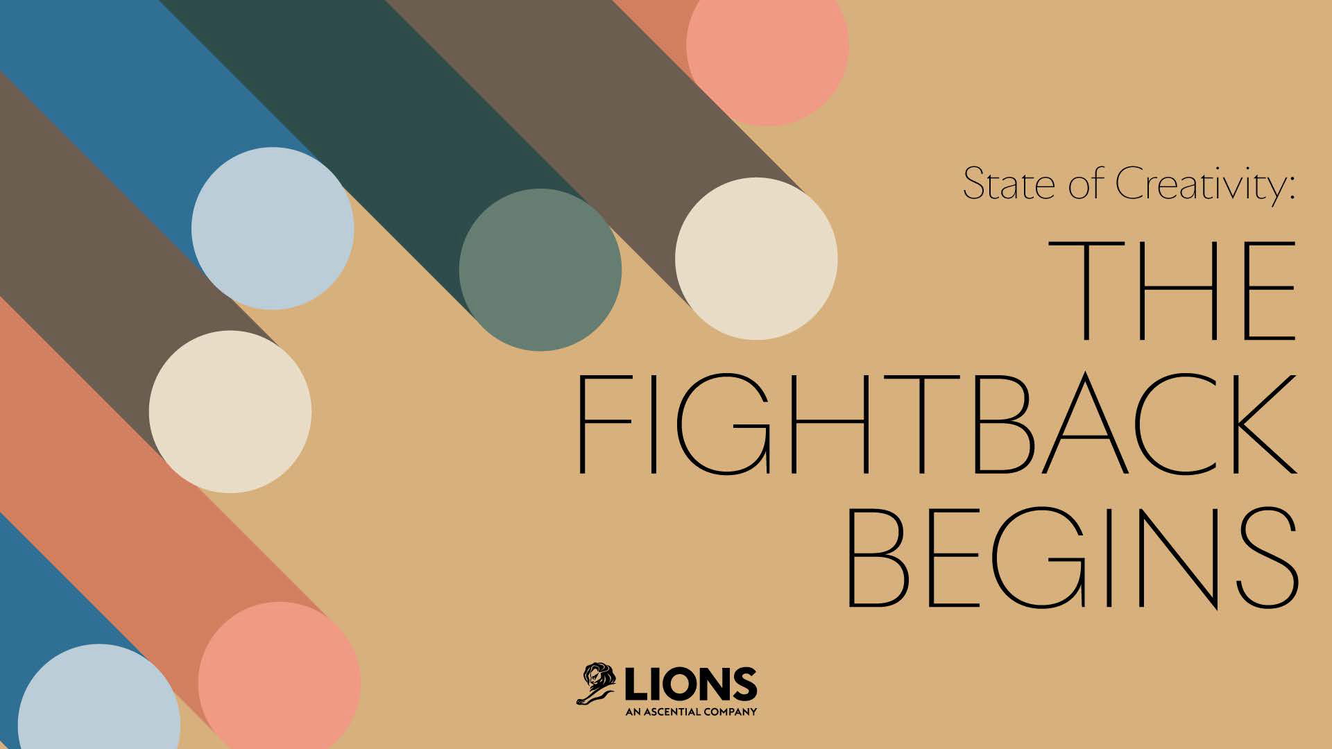
Lions’ report, ‘The State of Creativity’, explores similar territory to WeTransfer’s report. But this time, rather than a tour-de-force in interactivity, we get schooling in clean visuals, digestible copy, and beautiful layouts.
Nobody likes a wall of text, no matter how well researched it is. So, it’s great to see Lions deploying white space expertly. At crucial moments in the report, it draws attention to key visuals and copy with clever layouts. In addition, whole pages are dedicated to certain headlines or quotes, ensuring the most important ideas are as close to unmissable as possible.
Our expert’s eye:
‘Even 40 pages into this 58-page report, it doesn’t exhaust the eye. And amongst all that white space, the colours! Pastel grey, autumn gold, and then you end up in that warm honeycomb yellow. The right colours in the right shade are invaluable when it comes to readability.’
- Diego Arroyo, Creative Lead at Punch!
5. Know the Competition - Hubspot
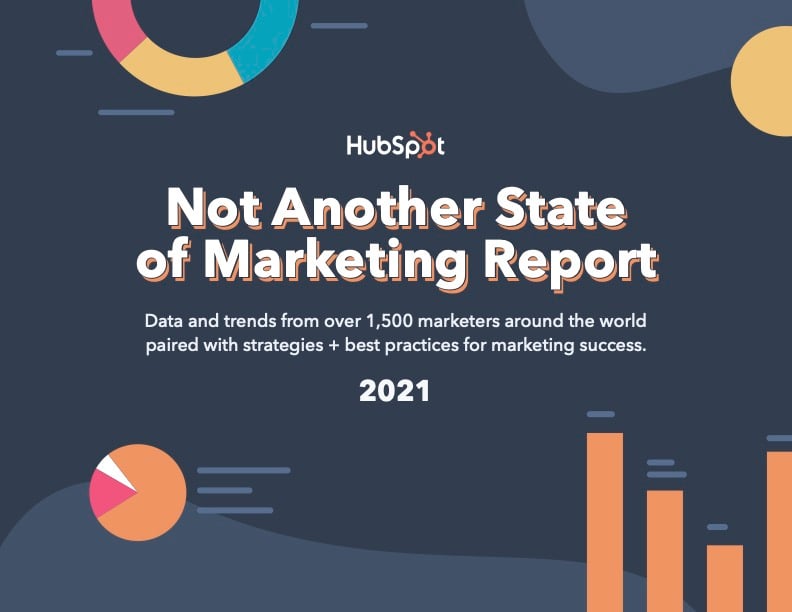
What’s nice about HubSpot’s ‘Not Another State of Marketing Report’ is its self-awareness. They know their industry is saturated with similar reports, so they’ve taken the step to poke fun at that in their title.
They’re aware of their competition, so they’re asserting their industry knowledge. Although their title claims distinction, they’re not just any old state of marketing report, which suggests new findings and novel insights to the reader. Like all the reports we’ve singled out, a simple, uncluttered layout means that this data-heavy narrative is also still easy to scan.
Our expert’s eye:
‘A cover page sells that first impression, not only of your report but of your brand, so it’s important to get it right not just from a design perspective, but from a copy perspective too. HubSpot does that fantastically.’
- Ellis Wells, Designer at Punch!
6. Be Flexible - Terminus
It’s the fifth year of Terminus’s State of ABM Report, which investigates the key trends and patterns circulating in the ABM world. The addition of subtle animations and a flexible navigation system adds life to what could have been a dry subject.
Where MailChimp’s characterful report created a linear journey through their findings, Terminus allows readers to navigate to whichever chapter they please. Your readers are always running out of time, so it’s essential to give them a route to the most valuable information. If that differs from reader to reader, you may want to think about taking a similar approach to Terminus. It’s a refreshing change not having to scroll through an endless PDF.
Our expert’s eye:
‘This is an informative design. It makes everything easy to digest, and the animations, whenever you transition, make the graphs and copy pop.’
- Anna Dormidontova, Designer at Punch!
7. Even Complex Can Be Simple - Spotify
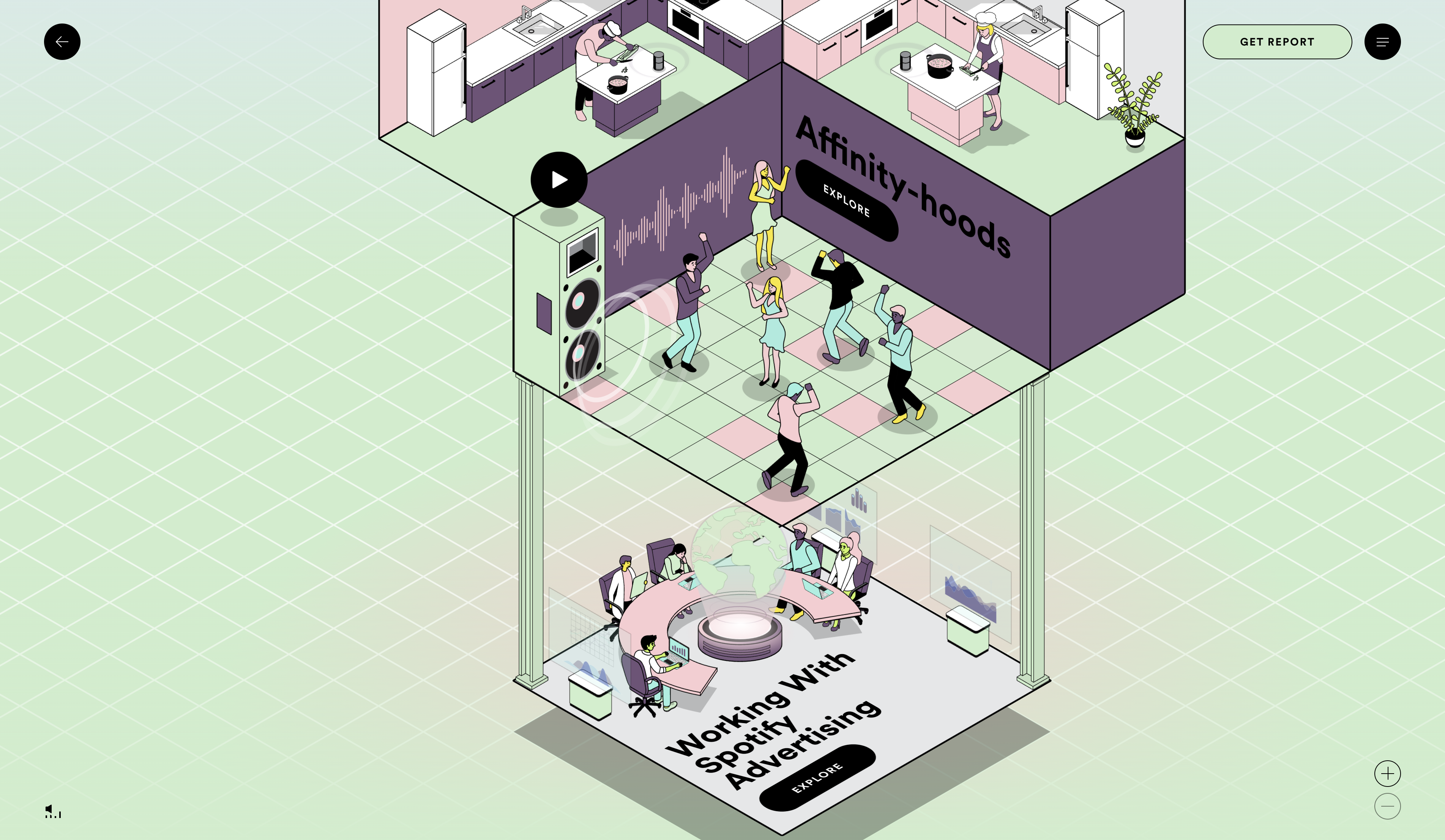
Spotify’s ‘Culture Next: 2021’ report explores how millennials and gen-Zs have driven a more inclusive and connected cultural landscape through their engagement with audio. True to Spotify’s penchant for playfulness and creativity, they’ve built a brilliantly interactive experience.
This report is all about exploration. Three different rooms with slick transitions of colour and audio unfold like a mystery box to reveal dance floors, kitchens, bedrooms, boardrooms bouncing with life. Despite a complex design and several multi-media elements, a commitment to simple illustration and user-friendly navigation makes for a fun, impressionable experience. As a result, what could have been a disorientating website is highly effective.
Our expert’s eye:
‘What’s also great about this report is you get two options. You can explore the interactive version of the report, or you can download a PDF and simply read through it, which means the report can work for multiple audiences.’
- Diego Arroyo, Creative Lead at Punch!
Be Adventurous
Not every report has to be as flashy as MailChimp’s or Spotify’s. Your brand will have its voice and audience, which should inform the structure, tone, and levels of interactivity you build into your report. That said, be adventurous. You never know who will come across your research and what judgments or decisions it will inform. So be characterful, embrace immersion and follow the rest of our lessons to the best of your brand.